"Building a Customer Feedback Dashboard with MCP and AI Chat"
Most customer feedback dashboards suck.
They count responses. They average scores. They show a few trend lines. Then they dump the actual hard part, the messy open-text feedback, into a table nobody wants to read.
That is not a dashboard. That is a guilt machine.
If you run a Shopify store, the real value of a customer feedback dashboard is not seeing that you collected 843 responses this month. It is being able to answer useful questions fast:
- What complaints are rising this week?
- Which feedback themes show up most among high-AOV customers?
- Are repeat buyers happier than first-time buyers?
- Which acquisition channels bring in the happiest customers?
- What are customers actually saying about Product X?
That is where MCP and AI chat change the game.
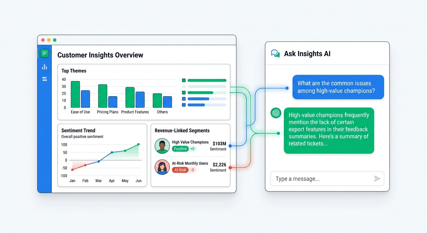
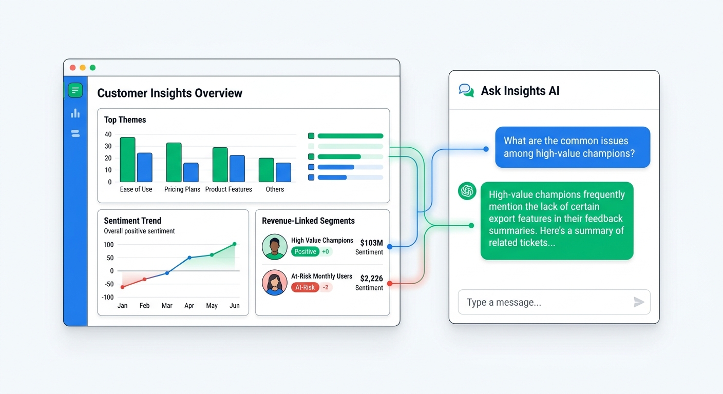
Instead of building a static dashboard that only answers the questions you planned for in advance, you build a feedback system that combines structured metrics, linked Shopify revenue data, and conversational analysis. The dashboard shows the baseline. AI chat lets you investigate whatever looks interesting. MCP is the bridge that gives Claude or ChatGPT direct access to the underlying survey data.
In this guide, I'll show how to build a customer feedback dashboard that is actually useful, what data to include, how MCP fits in, and why AI chat is a better layer on top of feedback data than another spreadsheet ever will be.
What a customer feedback dashboard should actually do
A good dashboard should help you make decisions, not just admire data.
For Shopify brands, that means a customer feedback dashboard should do four jobs well:
- Show the volume and trend of feedback so you know whether something is changing
- Group open-text responses into useful themes so you are not reading raw comments forever
- Connect feedback to orders and revenue so you know which signals matter most
- Make investigation easy when you want to ask a deeper question
Most tools handle the first job. Some handle the second decently. A lot of them completely whiff the third. Almost none handle the fourth without forcing you into exports, filters, and pivot-table nonsense.
That is why the best setup is not just a dashboard. It is a dashboard plus AI chat.
The dashboard gives you the overview. AI chat gives you the flexibility to explore. And when the AI is connected through MCP, it is not guessing from pasted snippets. It is working from your real feedback data.
Why static dashboards break once feedback volume grows
A static dashboard looks fine when you have 40 responses.
Once you have a few thousand, it starts to crack.
Open-text feedback does not fit neatly into charts
Customers do not complain in tidy dropdown values. They write things like:
- "Love the product but shipping felt weirdly slow"
- "I found you on TikTok and almost did not buy because sizing reviews conflicted"
- "Second order was great, first one arrived looking kind of beat up"
- "Support was helpful but I still could not figure out the setup at first"
A bar chart cannot capture that nuance by itself.
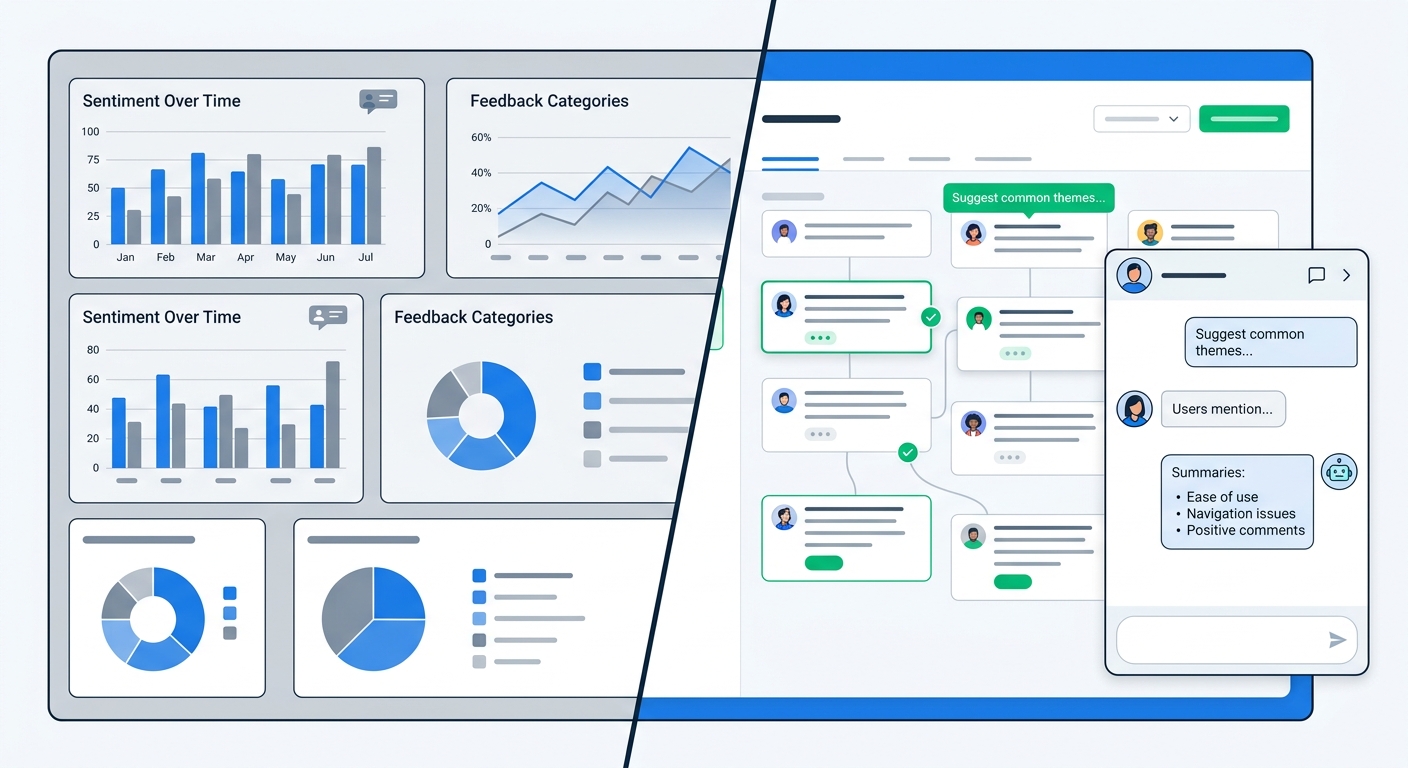
You need AI theme extraction to turn raw responses into clusters like shipping delay, sizing confusion, packaging damage, onboarding friction, and support praise. Then you need the ability to drill into those themes when the dashboard tells you one of them is moving.
The most valuable questions are usually follow-up questions
A dashboard might show that negative sentiment increased 18% week over week.
Cool. Why?
Now you want follow-ups:
- Which products are driving the shift?
- Is this mostly first-time buyers or repeat customers?
- Did the change start before or after the new shipping policy?
- Are customers mentioning one issue repeatedly, or several?
Static dashboards are bad at this because every useful follow-up requires another filter, another chart, or another saved view.
AI chat is better because you can just ask the question.
The core ingredients of a useful feedback dashboard
If you are building a customer feedback dashboard for Shopify, start with the data model, not the charts.
You want every response linked to enough context that the analysis can become commercially useful.
1. Survey response data
This is the obvious part.
Your dashboard should pull from the feedback channels that actually matter for ecommerce:
- post-purchase surveys
- popup surveys
- email surveys
- NPS and CSAT surveys
- app block surveys
- link surveys
- video testimonial prompts, when relevant
Different survey types answer different questions. Post-purchase surveys are great for attribution and immediate buying context. Email surveys are better for product experience after delivery. NPS and CSAT help with loyalty and service quality. A real dashboard should not trap these in separate silos.
2. Shopify order context
This is where weak feedback dashboards fall apart.
You do not just want the comment. You want the comment connected to:
- order value
- products purchased
- new vs repeat customer status
- discount usage
- acquisition source, when available
- date and fulfillment context
When feedback is linked to order data, you stop asking vague questions like "what are customers saying?" and start asking useful ones like "what are high-value repeat customers saying about our starter bundle?"
That is a very different level of analysis.
3. Theme grouping and sentiment layer
Open-text comments need an interpretation layer.
This is where AI-powered feedback analysis matters. Instead of manually tagging responses into categories, AI groups them into recurring themes automatically. That lets your dashboard surface patterns like:
- shipping concerns rising this month
- repeated praise for ease of use
- sizing issues clustered around one collection
- positive sentiment strongest among referral customers
You do not want a dashboard that just stores comments. You want one that organizes them.
4. Conversational access via MCP
This is the leap from "reporting" to "analysis."
MCP, short for Model Context Protocol, gives AI tools a structured way to access live external data. In this case, it lets Claude or ChatGPT connect directly to your customer feedback dataset instead of relying on screenshots, pasted CSV rows, or your memory of what the dashboard said.
That means you can ask:
- What are the biggest complaint themes in the last 30 days?
- Compare feedback from first-time buyers versus repeat customers
- Which channel drives the happiest customers by NPS and AOV?
- Summarize what customers say about packaging for Product A
And the AI can answer from the real data.
What metrics belong on the actual dashboard
You do not need 40 widgets. You need a handful of metrics that point you toward action.
Here is the setup I would use.
Feedback volume and response rate
Start simple:
- total responses by day or week
- response rate by survey type
- response mix by channel
This tells you whether your collection system is healthy. If response rate suddenly drops, something probably broke in timing, placement, or incentive design.
Satisfaction metrics
If you run NPS or CSAT, show them, but do not stop there.
Track:
- NPS trend over time
- CSAT trend over time
- promoter, passive, and detractor mix
- satisfaction split by first-time vs repeat buyers
- satisfaction split by product or collection
The important part is segmentation. An overall score can hide a lot of pain.
Theme trends
This is the heart of the dashboard.
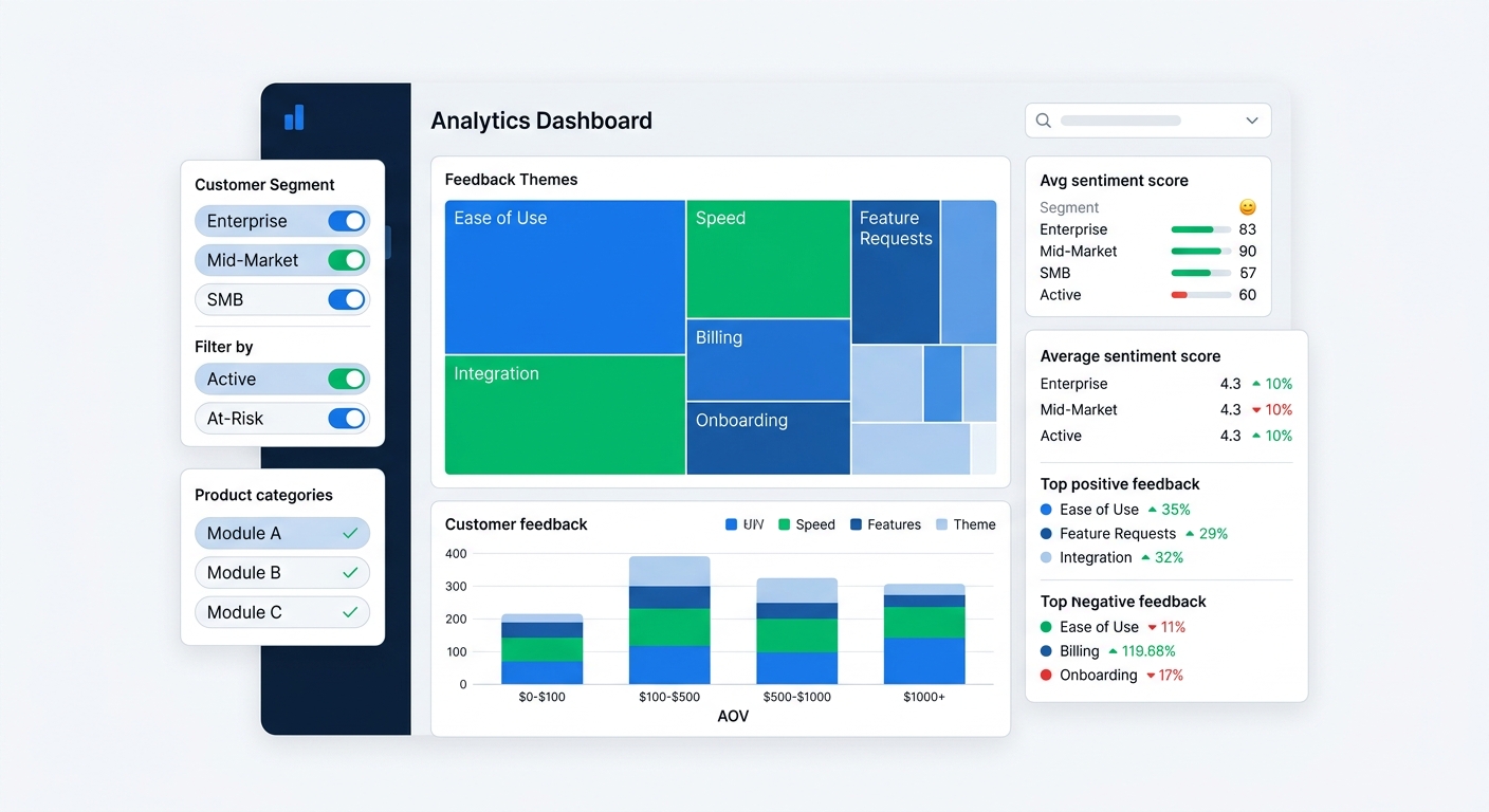
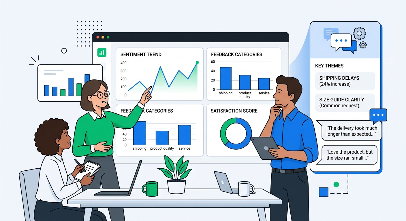
Show the top positive and negative feedback themes with movement over time. Not just total counts, but whether each theme is rising, falling, or stable.
Examples:
- shipping delay complaints up 24% vs prior 30 days
- setup confusion down 12% after onboarding update
- packaging praise up among gift buyers
- sizing complaints concentrated in one collection
Theme trends are what tell you where to look next.
Revenue-linked feedback segments
This is where a customer feedback dashboard becomes useful to leadership, not just CX.
Track feedback by:
- AOV band
- repeat purchase behavior
- product line
- acquisition channel
- discount use
Now you can answer questions like:
- Are high-AOV customers more forgiving or more demanding?
- Do TikTok customers complain about different things than search customers?
- Are discounted orders less satisfied than full-price ones?
That is the sort of analysis that changes marketing and product decisions.
Where MCP fits in
A lot of people hear "MCP" and assume it is some abstract AI plumbing detail.
It is plumbing, yes, but useful plumbing.
MCP is what lets your AI assistant query the live data behind the dashboard.
Without MCP, conversational analysis usually works like this:
- export CSV
- open a spreadsheet
- copy a chunk into ChatGPT or Claude
- ask a question
- realize you need another question
- go back and export again
That workflow is clumsy and fragile.
With MCP, the AI can directly inspect the connected survey and feedback data source. That means:
- fresher answers
- less copy-paste nonsense
- better follow-up questions
- analysis across larger datasets
- easier segmentation by date, product, channel, and customer type
For a merchant or marketer, the practical difference is simple. The dashboard tells you something weird is happening. MCP lets you investigate it through chat immediately.
If you want the broader setup context, our guide on how to use MCP to connect your customer data to Claude and ChatGPT covers the integration side in more depth.
What AI chat adds that dashboards cannot
Dashboards are good at monitoring. AI chat is good at exploration.
You need both.
Dashboards answer recurring questions
These are the questions you want answered every day:
- how many responses came in?
- what is our NPS trend?
- what are the top complaint themes this month?
- which product has the lowest satisfaction?
That is dashboard territory.
AI chat answers messy human questions
These are the questions that appear in the middle of a meeting, or when you notice something odd:
- Why did satisfaction drop among repeat buyers last week?
- What are people who mention TikTok also saying about delivery speed?
- Summarize the biggest complaints from customers over $100 AOV
- Are packaging complaints tied to one warehouse window?
- What positive themes show up most among customers who later bought again?
You do not want to wait for a BI ticket for those.
You want to ask the question and get an answer now.
That is why chatting with survey data using AI is more than a novelty. It reduces the gap between noticing a signal and understanding it.
A practical dashboard layout for Shopify brands
If I were setting this up for a Shopify team, I would keep the dashboard tight.
Section 1: executive snapshot
At the top:
- total responses this period
- NPS or CSAT trend
- top 3 positive themes
- top 3 negative themes
- response rate by survey type
This is the one-screen overview.
Section 2: theme analysis
Then go one layer deeper:
- top themes by volume
- theme change vs prior period
- theme split by product and collection
- representative quotes for each theme
The quotes matter. Otherwise teams start arguing about what the theme label means.
Section 3: revenue and retention lens
This is where most teams should spend more time than they currently do:
- feedback by AOV band
- feedback by first-time vs repeat customer
- promoter repeat purchase rate vs detractor repeat purchase rate
- themes associated with refunds or repeat purchases
This section turns feedback from "customer experience reporting" into business intelligence.
Section 4: AI chat panel or connected assistant
Finally, make the conversational layer easy to reach. If the AI tool is buried in another app or another workflow, people will not use it.
The ideal flow is:
- see a signal on the dashboard
- click or open chat
- ask follow-up question
- get answer with examples and segment breakdown
That is much faster than building bespoke reports every time someone is curious.
Common mistakes when building a feedback dashboard
A few traps show up over and over.
Mistake 1: treating every response equally
Not all feedback has the same business weight.
If a complaint theme appears mostly among low-intent bargain shoppers, that matters differently than the same theme appearing among repeat customers with high lifetime value.
Connect feedback to revenue and customer quality, or you will overreact to noise.
Mistake 2: obsessing over averages
Average satisfaction scores flatten reality.
You need the distribution, the segments, and the themes underneath. Otherwise a stable average can hide a growing issue in one product line or customer cohort.
Mistake 3: storing open-text comments without analysis
If your dashboard just includes a raw comments table, congratulations, you have built a digital junk drawer.
You need AI grouping, theme trends, and drill-down capability.
Mistake 4: separating feedback from action
Feedback should route somewhere.
- shipping complaints -> ops
- sizing confusion -> PDP and merchandising
- product feature requests -> roadmap
- support frustration -> CX
- positive review candidates -> testimonial outreach
A dashboard that does not trigger action is just a prettier spreadsheet.
Why UserLoop is a strong fit for this kind of dashboard
The hard part is not displaying survey data. Plenty of tools can do that.
The hard part is combining multiple survey types, linking them to Shopify orders, grouping open-text responses with AI, and making the data accessible through chat.
That is where UserLoop has a real advantage.
UserLoop gives Shopify merchants:
- seven survey types in one platform
- AI-powered theme extraction and feedback analysis
- revenue-linked survey data tied to orders and AOV
- MCP support for conversational analysis in Claude or ChatGPT
- cross-workflow use cases from attribution to product feedback to NPS
That combination matters because customer feedback is not one workflow. It is an operating layer across marketing, product, support, and retention.
Start with one dashboard, then make it queryable
If you are building from scratch, do not overcomplicate it.
Start with a dashboard that shows:
- response volume
- satisfaction trend
- top feedback themes
- revenue-linked segments
Then add the layer that most teams are missing: conversational access through MCP.
That is what turns a passive reporting dashboard into a working feedback system.
If you want to build a customer feedback dashboard without living in exports and spreadsheets, start with UserLoop's AI insights, connect your survey data through MCP chat, or install UserLoop from the Shopify App Store to tie feedback directly to Shopify orders and revenue.


The agentic growth toolkit for Shopify
Ask your customers anything
UserLoop talks to your customers at scale with surveys and contests that feed one AI-queryable dataset. AI does the setup and the analysis.
- SurveysFind out why customers buy: checkout, email, link & QR.
- ContestsGiveaways that grow your list and social following.
Free plans on both apps · live in minutes